Archive | September, 2010

Where’s the love?

29 Sep

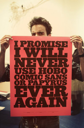
Yesterday in class, I had the conversation I dread a little bit each semester: telling a student to avoid a certain font like the plague. Usually the font in question is Papyrus. Often times it is Comic Sans. This time it was Hobo.

You see, for better or for worse, there are a few fonts that you must avoid using if you wish to be respected as a graphic designer. Sometimes these fonts have a bad rap because they are horribly overused. (I guess I could apply this logic to my beloved Archer, but I’m not ready yet.) But mostly it is because these fonts are just really, really bad.

The graphics community is an opinionated place, and people feel very strongly about these things. This is one reason I urge my students to be able to stand behind and defend their choices when appropriate. But the use of Comic Sans without irony? You may want to find another profession, folks.

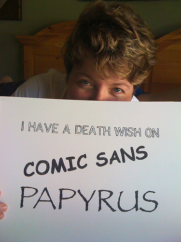
The poster shown above was designed by Jeff Matz of Lure Design, and can be found around the web. (There’s even a Facebook group.) BUT, it is worth noting that in the August 2010 issue of Print Magazine, prolific graphic design writer Steven Heller blasted the common practice of presenting a piece graphically through someone having their picture taken while holding it up. Sometimes you just can’t win.

But you can learn to defend your choices.

More opinions below.

The secret forest of Berlin, Wisconsin.

28 Sep

So I was sitting at the kitchen table the other day, eating soup and looking at the mail on the table. Apparently, there wasn’t much to look at, because I started to study the new Berlin phone pamphlet, er, phonebook. Anyone who is familiar with Berlin is likely aware that there aren’t a lot of trees behind the post office. Or City Hall. Especially not the same Photoshop trees, copied and pasted.

Also, anyone who is familiar with Berlin probably knows that a restaurant menu guide for the city is kind of a silly idea. For starters (no pun intended), a Subway menu takes up a full page of a four-page section.

It’s a Monday night party!

27 Sep

While doing errands around Oshkosh this morning, it was fun (as it always is on gameday) to see so many people wearing green & gold. Now, I’ve never been a superfan of any team (see vehicle above, with my possible future superfan)(heck, she knows the “Go, Pack, Go” jingle already), but I like the spirit of it all.

Anyway, Packers at Bears tonight. Both teams are 2-0 this season, but the decades long rivalry favors Chicago 90-82-6. My name might say Cutler, but I’m rooting for the Pack.

A reason to procrastinate…

24 Sep

…even if this short animated film worsens your procrastination. It is Friday, after all. And you’ll be all the better for it after being reminded what techniques like stop-motion animation and drawing by hand can do to drive a point home. The film’s creator, Johnny Kelly, has many, many activities here to share… nearly everything except the job requiring completion.

My favorite is the organizing of bookshelves by color. In fact, I’m going to do that now. Never mind all of the other (more important) stuff waiting for my attention.

Now, this is a meeting.

22 Sep

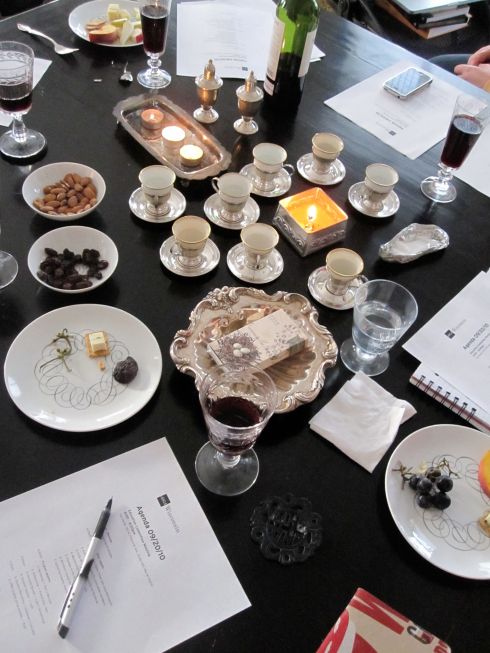
Here are some images from the AIGA Wisconsin Education Committee meeting I attended on Monday night. The meeting took place in designer and artist Carol Kerr’s beautiful studio, which is located in Milwaukee’s historic Third Ward. I’ve always been a person who is deeply affected by the space I find myself in, which is sadly often lit by florescent lights. Can candles and stunning city views aid productivity? (And yes… that is a bottle of wine.) I don’t know the answer to that, but as a committee we have some amazing events planned for design students here in Wisconsin. Stay tuned.

Lushootseed

20 Sep

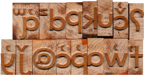
I just accepted an assignment to write an article about a brand new typeface called Lushootseed for the Mid America Print Council Journal. The typeface was designed by designed by Juliet Shen of Seattle. This will be an especially interesting investigation, as the new typeface has recently been crafted in wood type at the Hamilton Wood Type Museum in Two Rivers.

Lushootseed is the official language of the Tulalip, a Native American tribe from Washington State. The language was near extinction, mostly the result of the U.S. Government “assimilation” campaign of 1912, which sent Native children off to boarding schools, where they were required to speak only English.

Stay tuned as I learn more!

Chic Boo-Boo

17 Sep

Does an elaborate design make it hurt less?

Dubious Placement

17 Sep

Spotted at Fleet Farm the other evening. Herbicides, pesticides, fertilizer, peat moss… board games! Obviously, there was some sort of transition in process, but still.

The Whitney Music Box

15 Sep

I’ve been listening to this for about fifteen minutes now, and it may very well be driving me crazy.* But  The Whitney Music Box is a very cool thing, and I wanted to share it. Image and sound, working together.

What is it? Essentially, it’s an animation which uses visual patterns to create music. According to the site’s creator: “Each of the 48 dots is moving in a circle. Each of the dots is on a 3 minute cycle. At the end of 3 minutes, the outermost dot will have moved around the circle once (this dot represents the first harmonic or fundamental). The next dot will have moved around the circle twice (representing the second harmonic). The next dot three times, and so on. The innermost dot moves around the circle 48 times. Now, imagine these dots are raised bumps on a disc which is controlling a music box, with each bump triggering a note when it passes the zero degree line (a line extending from the center to the east).”

If you are interested, I recommend trying the variations (#20 would be ideal for a sushi restaurant) and/or the related “Wheel of Stars.”

*I borrowed a Steve Reich album from Edwin a few years back, and it had a similar effect.

Six feet tall (and absolutely beautiful).

13 Sep

Unless you are living under a rock, you are aware that the new NFL season is underway. (And the Packers have an undefeated record so far! In the regular season, anyway.) Since this is my platform for such a thing, I’d like to give a shout out to the gorgeous numbers that indicate yards on the gridiron. I’ve enjoyed them since I was a kid.

While cursory research didn’t turn up the exact typeface (if you know, tell me), the numbers seem very similar to a Clarendon. I was able to find measurement specs: the numbers on the field are six feet tall and can be upwards of four feet wide. Point size? Good question.

If you want to admire some other beautiful digits, I suggest Hoefler & Frere-Jones’ Numbers typeface. Lovely.

And Go, Pack, Go!