Archive | February, 2011

“Live in colors, dream in colors”

27 Feb

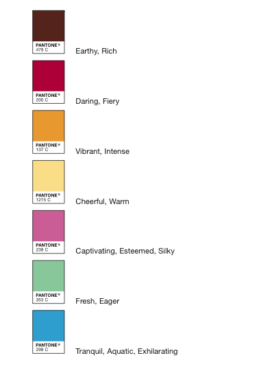
This is the tagline of, I kid you not, the Pantone Hotel. I read about it in today’s New York Times. Planning a visit to Brussels? Whether you are visiting for business or pleasure (or for waffles), you can customize your accommodations in the Belgian capital to reflect your current mood. Each of the seven floors has its own color scheme–see swatch chart just below. (Are those on the blue floor expected to feel tranquil and exhilarating at the same time?)

Feeling vibrant and/or intense? Daring and/or fiery? It looks like you can borrow a colorful bike to ride around town. I’d be happy just to lounge around eating chocolate on the cheerful/warm floor.


Um, awkward….

25 Feb

Noted this morning in Oshkosh outside of the donut shop. I don’t understand what this means. And that’s probably just fine.

Long live print design, no matter the platform

24 Feb

Above: a sample page from The Daily. And I still love Portlandia, btw.

I was really interested to read this article over lunch today, as I’ve been craving to read more about what happens when we take traditional typography and layout techniques and apply them to digital media. I wish it was longer, but it’s a good general overview. Regardless of what you think of Rupert Murdoch’s media empire, The Daily, his new iPad-only publication, is an intriguing mix of traditional print design and 21st-Century technology. It’s a little vanilla overall, but  it’s a new new world out there, and legibility should always come first. (Digital Trends has a good review of the user experience.)

“It’s comforting to see the well-tested tropes of print design translating to digital,” writes Ty Fujimura. “Paper itself is doomed to antiquity, but the design theory developed during its reign is effective and just as relevant for other media. Web content has traditionally been restricted to unexciting, homogeneous design by technological limitations. But advancements like HTML5 and devices like the iPad are freeing designers to create imaginative, stimulating interactive design rivaling what they could do in print.”

Since the introduction of the iPad, I’m interested in not only designing for the screen, but reading off of it as well. If I could only control the compulsion to continually click on links….

Rolling down the river in transit map style

24 Feb

Check out Daniel P. Huffman’s interpretation of the Mississippi River system, designed in the style of the contemporary transit map. Of course, you are missing the delightful organic twists and turns, but clarity is gained, and it’s all pointing towards New Orleans. I grew up on the St. Croix River, and crossed the Mississippi nearly every single day as an undergrad, as it divided the campus of the University of Minnesota. When I was in grad school, I crossed the Iowa River daily, which divided the campus of the University of Iowa. And though it isn’t pictured on this map (because it runs north into Lake Michigan), I find it continually amusing that I cross the Fox River not once, but twice to get to work each day.

There is something very powerful about a river. They are complex, living things–and they draw a beautiful line, however you choose to interpret it. Boundary, navigational system, watershed….

Huffman is a lecturer on cartography at UW Madison, and has this to say about the project:

Rivers have been a key part of urban life for centuries. They have provided us with drinking water, protection, and a transit network that links us from one settlement to the next. I wanted to create a series of maps that gives people a new way to look at rivers: a much more modern, urban type of portrayal. So I turned to the style of urban transit maps pioneered by Harry Beck in the 1930s for the London Underground. Straight lines, 45º angles, simple geometry. The result is more of an abstract network representation than you would find on most maps, but it’s also a lot more fun. The geography is intentionally distorted to clarify relationships. I think it helps translate the sort of visual language of nature into a more engineered one, putting the organic in more constructed terms. Not every line depicted is navigable, but all are important to the hydrological systems shown.


“It’s air, you know. It’s just there.”

23 Feb

{My first repost, on the occasion of yet another class seeing Helvetica.}

I just showed Gary Hustwit’s documentary, Helvetica, in my type class this afternoon. I have now seen it six or seven times, and I never fail to learn from it. What I most appreciate about this film is the breadth of perspectives and emotion relating to what was first called Haas Neue Grotesk: acceptance, reaction, re-acceptance, boredom, satisfaction.

Anyway, here are some of my favorite lines from the film (thanks to IMDB):

You can say, ‘I love you,’ in Helvetica. And you can say it with Helvetica Extra Light if you want to be really fancy. Or you can say it with the Extra Bold if it’s really intensive and passionate, you know, and it might work. Massimo Vignelli

The meaning is in the content of the text and not in the typeface, and that is why we loved Helvetica very much. Wim Crouwel

It’s air, you know. It’s just there. There’s no choice. You have to breathe, so you have to use Helvetica. Erik Spiekermann

I think I’m right calling Helvetica the perfume of the city. It is just something we don’t notice usually but we would miss very much if it wouldn’t be there. Lars Müller

I’m obviously a typeomaniac, which is an incurable if not mortal disease. I can’t explain it. I just love, I just like looking at type. I just get a total kick out of it: they are my friends. Other people look at bottles of wine or whatever, or, you know, girls’ bottoms. I get kicks out of looking at type. It’s a little worrying, I admit, but it’s a very nerdish thing to do. Erik Spiekermann

When you talk about the design of Haas Neue Grotesk or Helvetic, what it’s all about is the interrelationship of the negative shape, the figure-ground relationship, the shapes between characters and within characters, with the black, if you like, with the inked surface. And the Swiss pay more attention to the background, so that the counters and the space between characters just hold the letters. I mean you can’t imagine anything moving; it is so firm. It not a letter that bent to shape; it’s a letter that lives in a powerful matrix of surrounding space. It’s… oh, it’s brilliant when it’s done well. Mike Parker

It’s The Real Thing. Period. Coke. Period. Any Questions? Of Course Not. Michael Bierut


Rulebreaker

22 Feb

The other day, a student pointed this sign out to me. I’ve probably walked by it thousands of times while entering the building where I work without paying any attention. No food or drink in the A/C? Really? The vending machines just inside the door should be ashamed of themselves. Here I sit in my office upstairs, drinking coffee behind closed doors like a criminal!

But, seriously, if signs don’t make any sense, why read them? I just find it interesting that I’ve ignored this sign for seven whole years. In general, I’m very observant, almost to a fault.

Next, I’d like to know why the outer set of doors are newly handicapped accessible (finally!) while all of the vestibule doors still have manual knobs. It’s either that or the stairs.

I’d totally take this class.

21 Feb

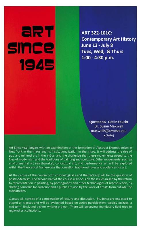
Need an upper-level Art History class? Do you dig contemporary art? (Even if you don’t, it is a genre designers should know about.) Does your apartment lack air-conditioning in the summer? If so, drop everything and register for ART 322-101C: Art Since 1945, taught by my friend and colleague, Dr. Susan Maxwell. It’s a summer class, and runs from June 13th to July 8th. And there are field trips! Sign me up.

It’s a scavenger hunt!

21 Feb

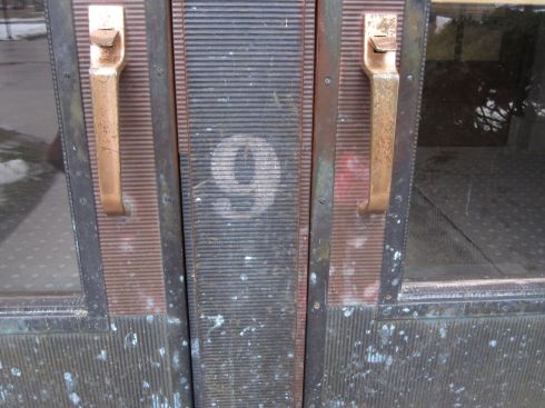
I’ll give a prize to the first student who can tell me where this lovely number is located.

Get ready to rumble (in a typographic sense)

21 Feb

I’m not sure how I missed this until now, but the good people at College Humor posted  “a sequel” to the beloved Font Conference clip. Videos are super good on snowy days. I couldn’t get it to embed (you’ll have to, sigh, click on this link), but here’s the earlier clip:

As seen in The Northwestern, 1972

18 Feb

I came across this very randomly just now, and it is too good not to share. The “long-haired culture” indeed. Communes! I bet this scared the hell out of residents of our fair city as they read the morning paper in their soon-to-be-outdated homes.